Helvetica

Date February 8, 2008

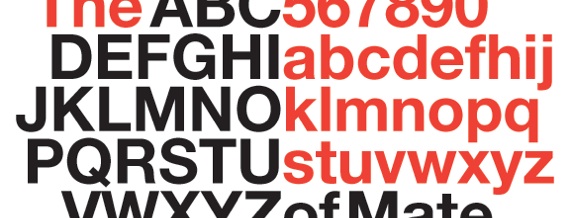
I watched Helvetica the other day, at the recommendation of my good friend Adam. It’s a documentary about the typeface, Helvetica - one that is familiar to all computer users (Mac & PC) and everyone else in the world. Helvetica has always been a font I’ve avoided using because it looks so boring. However, it was really interesting watching this film and hearing perspectives about Helvetica from designers, its creators and severe critics of the typeface. There are some really great interviews in the documentary, including one with German typographer and designer, Erik Spiekermann, in which he talks about how he just loathes Helvetica (it’s quite humorous).

After watching the film, I started to see how Helvetica really can be a beautiful font if used well, and I hope to get a chance to try it out in some future designing. It also inspired me to be on the lookout for Helvetica used around the city. I went to New York City yesterday for the afternoon, and got a chance to photograph Helvetica in action. I’m pretty sure that all of the images in this Helvetica photoset are using Helvetica, but if you notice one that’s not, please let me know.

What about everyone else? Anyone seen the film? Anyone really like or dislike Helvetica?

Tags: , , , , ,

15 Responses to “Helvetica”

  1. J. Brent Bates said:

    I noticed that Netflix has this available for watching instantly online. I’ll be watching it soon.

  2. Scott A. said:

    I’ve been wanting to see this - glad to hear that it’s good! I have a pretty intense love-hate relationship with Helvetica. So much of the design around me is “thoughtless” or “conformist” Helvetica, used simply because it is a visual default (don’t even get me started on that bastard font Arial…). But then again, when used well Helvetica is one of the most beautiful typefaces around.

    I wrote a bit about it once, but tossed the piece aside. Seems mildly appropriate, so I’ve pasted it below.

    Helvetica christens text and brands with a cold, dispassionate modernity that is “at once populist and authoritarian,” but undeniably pervasive (McCarthy). Calculated with geometric precision, the font’s sharp lines and smooth curves proclaim certainty and calculation. The type subverts diversity and dissent by imposing a discreet rationality upon its content, clothing it in the garb of the corporate. Uniting politics, culture, and typography, designer Michael Bierut argues that “Helvetica was introduced at a moment where…people had real confidence in modernism and modern institutions to solve the world’s problems…Helvetica was “a beautifully machined, rationally resolved, entirely modern typeface that seemed absolutely suited to its times.”

    It’s hardly surprising that Helvetica was completed in Switzerland, 1957. The typeface was “introduced at a moment” – the moment even, when the budding optimism following the reconstruction of Europe cried out for a container fit to display the words of a fledgling global society committed to security, progress, and peace. Today, Helvetica and its look-alike cousin Arial are the default sans serif fonts on nearly every computer sold. Decorating the billboards, signs, and logos of our cityscapes, these typefaces proclaim the success of efficiency, manufactured type, and a hegemonic, calculated perfection.

  3. anita said:

    What a funny topic and while I didn’t know such a film was out there it’s now a ‘must-see’ on my list! I loved Helvetica from my old typesetting days in college. Clean, crisp, bold, but then I’m Swiss so that might explain my love for it. Of course, then Tekton came out and because I’ve always written like an architect (taught myself in college because I hated my cursive writing) it felt like a font made for me.

    Okay, now off to check for the film online and off….

  4. Victor said:

    i was going to watch helvetica a few weeks ago but then realized it’s basically the same thing as arial, which has been my font of choice since i started using the internets a long time ago. i may still watch it since it’s free on netflix.

  5. Bruce Reyes-Chow said:

    Dude, next you are going to say that Comic Sans is the font of the future. Wow. Naw, now I just might at it to the ol queue

  6. Ben said:

    Personally, I love Helvetica. But I’m just odd that way. I’ll definitely have to check out that flick.

  7. Ian said:

    I really enjoyed the film. It was inspiring (as a designer myself seeing some of the greats speak of their love/hate relationship with the typeface) but also it was a story of the shift of modernity to post-modernity from the perspective of a typeface, Helvetica.
    I wrote about my personal feelings on my blog: http://iansoper.com/wp/design/helvetica/

  8. JennySmith said:

    I have not seen the movie. However, whereas I do know it’s possible to get Helvetica for a PC, I do know that it’s not a default font. That’s why in the web type specifications it goes “Arial, Helvetica, Sans-serif.”

    I think Helvetica is ok. I really like Helvetica Neue.

  9. J. P. said:

    I know I’ve used Helvetica Narrow when space is at a premium, usually in tabular stuff (e.g., spreadsheets), but otherwise, I don’t ever recall choosing it consciously. Helvetica Neue Light looks like it might have some possibilities, though!

  10. Don said:

    Uhhh… yeah, that’ll go into my Netflix queue right after that Cannes award winning film “Cursive, the early years; 3rd graders in Sommerville, NJ”

  11. Cody Stauffer said:

    To be honest, I was perplexed why they would make a documentary about something like this, but having read a few of the posts, it actually interests me because I’ve never thought about it before, but it makes sense how events going on all around us and philosophical nuances show up in things like font designs, and how they reflect and impact the current “mood” in a particular locale. Very interesting.

  12. J. Brent Bates said:

    I agree with Ian. Especially since I don’t have design experience, for me this documentary was primarily about 20th century culture. And also whether or not meaning is intrinsic within aesthetics.

    Excellent recommendation.

  13. Daniel Miller said:

    Don’t let the guys from vaux ppl hear ya or you’ll get an earful!

    You don’t allow image tags in your comments?

    And @JennySmith: It’s “Helvetica, Verdana, Sans”, just for the record!

  14. A.S.T. said:

    Don’t know what it’s like up in New Jersey, but most of the highway signs I’ve seen in NC are in Helvetica. Also, don’t know if you’ve read much in the way of Marshall McLuhan (journalist, communications analyst, and witty cultural critic) but he’s got quite a bit to say about how the shape of a font can affect everything from one’s mood at the time of reading to one’s overall perception of the material being read. Quite interesting, if you ask me. Personally, I think that fonts “sans serifs” are quite dull if over-used. In fact, there seems to be an interesting cultural phenomenon afoot wherein more folks are writing books with specially designed (mostly “with serif”) fonts. In some cases, I think this might be McLuhan’s influence…who knows. At any rate, I’d be interested to see the documentary…it sounds sufficiently nerdy for my tastes.

  15. April said:

    As a font geek, I thought you’d appreciate this: http://blog.extensis.com/typecaster/.

Trackbacks...

Leave a Reply

XHTML: You can use these tags: <a href="" title=""> <abbr title=""> <acronym title=""> <b> <blockquote cite=""> <cite> <code> <del datetime=""> <em> <i> <q cite=""> <strike> <strong>

Close