
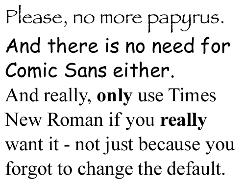
These should not be used anymore. Not on blogs, websites, PowerPoint presentations(!), or anything else.
I know this is going to be a controversial post. I understand that personally. My wife really likes Comic Sans, while I think we should Ban Comic Sans. We have gotten to a point where we just don’t talk about Comic Sans, because we know that things get ugly.
And it’s not that I’m against serifed fonts. I really like Georgia and many others. But I am tired of seeing websites, church bulletins and everything else done with Times New Roman. It’s irritating because you know there was most likely no thought put into it – Times New Roman is just the default, so they keep it. There isn’t any thought into typography.
And…when there is some thought put into choosing a font – people generally try something creative like Papyrus. I tried it a few years ago, I’ll admit that. But no. Not anymore. Something about it just grates against me…
…stepping off soapbox now.
No related posts.


{ 41 comments… read them below or add one }
Did we wake up a little angry today?
here here. for a fun anti papyrus site, go here: http://www.iheartpapyrus.com
I myself am a fan of 9-point Verdana. When you have to ability to change the default – change the default.
Comic Sans is for small-minded people.
Word.
Times New Roman = Coudal = Beauty
Kyle – so what are you saying?
A classic like Times, and associated families, can be used properly and with grace. Most of the the time not, with intelligence, yes…
A good exercise would be to comp a layout using all the hated techniques and type that you can think of and see if you can resurrect them visually.
All type can be redeemed.
What’s wrong with Comic Sans? Only that it makes me want to vomit in my mouth. Thanks for this important post, Adam.
I won’t hold it against you but I have my body text on my site in Times New Roman.
Good typography is one of the most difficult areas to master, and it’s still so subjective. And I do think that comic sans and papyrus should be drown in a pit along with MySpace and AOL email addresses.
you should ask my wife about fonts. we’ll be driving down the interstate and i’ll start naming fonts on billboards. she gets pissed. except of course when she’s designing something and wants my help finding a font.
Very funny. The benefits of one flesh.
i totally agree about times, but not about comic sans… i’m not against giving it up, but as a kindergarten teacher, i haven’t found another font that comes as close to being how i teach kids to write their letters. do you have a suggestion of a substitute that would be easy for 5 year-olds to read?
update…
i just looked through fonts and century gothic would work for kindergarten… now i’ll have to decide if i’ll buy into adam’s tirade and make the switch :)
2 links:
A Typophile Thread
Type Club makers of Sassoon… click thru to the Sassoon page.
Century Gothic, or variants thereof, is a base install on most computers.
Lauren, Century Gotchic is what I use for the Titles of the Blog Posts you see on this blog. I’m a fan of it.
josh – yes, I do the same thing. We’ll go somewhere, and I’ll either see a cool font or a really bad one (IMHO) and I’ll say, “Sarah…what font is that…?” and she’ll just look at me. I don’t think she likes the game. It’s okay. However, I did turn her onto Optima for quite awhile, which is a classy font. I was using that for a ton of stuff last spring, but haven’t used it much since then. It’s funny how I go through “seasons” with certain fonts.
Amen…I agree 100%.
Comic Sans?
Fine by me.
My husband and I are both fans of Trebuchet, and I’m a big fan of Georgia.
My two cents.
As if Insufferable Music Snobs weren’t bad enough now we have Insufferable Font Snobs?
How about ‘Mistral’?
Or Arial in a long printed document – c’mon people, it was designed for the screen.
As for the screen… thank God for Firefox (et al) letting you ctrl+ your way to actually being able to read the font that a lot of sites use. Note to 20-something designers: not all of us can read an 8-point font! And Nate, 9-point is still pushing it for some people, particularly if there is a lot of text (long article). Designers should bear in mind that after all the tweaking, fidgeting, and making everything line up just so, people like me are going to arrive, be unable to read it comfortably, and ctrl+ your design into something you didn’t intend. Absolute worst offender: the Benevolence theme for WordPress. Miniscule type thoughtully presented in TNR. Blech.
btw Adam, the font you’re using for your post headings and in your blockquotes doesn’t render smoothly on Linux, looks a bit pixellated.
We can all be a little grouchy when you hit on pet peeves…!
When I was in full-time youth ministry, I not only deleted the Comic Sans file from my own computer, I then secretly deleted it from every church computer and forbid any of my staff to use the font…I hate, hate, hate it. And I think I hate it so much because so many people use it for youth ministry because it’s “fun” looking…
While we’re on the subject, this reminds me of a post from Cameron Moll’s site about Typefaces no one gets fired for using.
Adam – is there a site, or a list of fonts that tend to be easy to read and look nice?
Papyrus is particularly popular amongst church-y types these days. It’s so “ancient-future” you know? Vomit.
In a hopefully good step for web design, Vista and Office 2007 came with a new family of fonts that will hopefully expand our palette. Calibri is quite nice, but will probably become hated as its the default in Office 2007.
How unpostmodern and unprogressive. :)
(Oops, are emoticons banned as well for not being sophisticated enough?)
I like comic sans a little,
but in Atlanta there is this small business pizza franchise that started and everything, from their signs on the windows, menu, display menu, pizza boxes, etc was in Comic Sans.
it was hilarious.
lol! We use Times New Roman for our museum’s exhibit labels. Because it’s easy on old people’s eyeballs. Truth.
fonts? and you could post about the koozies? ridiculous.
garamond is a cool font–it shortens papers when needed
i just think it’s hilarious that this post got more comments in one night than your “what is truth” post did in two days :)
I never heard that one before. I know people choose “fat” fonts to lengthen papers, not shorten them! Hahaha. :D
Good post. I agree with Papyrus and Comic Sans (who doesn’t?!). Times New Roman too, though I can’t fault the rest of the world who (are forced to) use it.
I work in an elementary school, and almost everything I do is Comic Sans. It actually looks like normal text any more. Come on, this is a ridiculous post.
adam, does your font complaint presuppose that the people selecting fonts have good taste? one function that times new roman serves is that it is a ‘safe’ font. blah, sure, but there are those of us who know that left to our own devices, we would be writing emails in wingding before we knew what happened.
in other words, defaults are not always a bad thing.
i’m with you on comic sans, however.
ps: secret admirer of papyrus
Completely agree.
However, the 4th font that should not be used anymore is…. BANK GOTHIC
but wait, you use that in your header…
After six months of design work for a new company and a fickle headed owner she knows what she wants; “Papyrus with a bit fo tweaking to make it original.” Barf. But, I want the money so I do the job.
comic sans + papyrus are fonts fonts “we” ladies like. Why are you bothered by it? There is no account to taste. Praise the Lord we can still choose anything we like. Hopefully this won’t be the start of some “web-font-police”… I fear the day I will get fined for using a font that is not approved by a bunch of website “GODs” or “Gurus”. (evil, EVIL grin).
shanna, relax. Ever heard of tongue in cheek? Gotta watch it when the amazon ladies come out of the type setting jungle to defend their turf. You probably like Brush Script too. {wink, WINK, nod}
Comic Sans is ideal for working with kids. And, honestly, I like Papyrus, but there seem to be almost zero occasions where it would be appropriate to use. And that – to me – is the key to the problem: choose your font in accordance to its use. It “has to fit”. Then all fonts probably have their place.
MLA requires students to use Times New Roman.. It's a professional font, not because people are "unoriginal". Keep your opinions to yourself next time because this is just a waste of a post.